

 Energy and environment | Climate
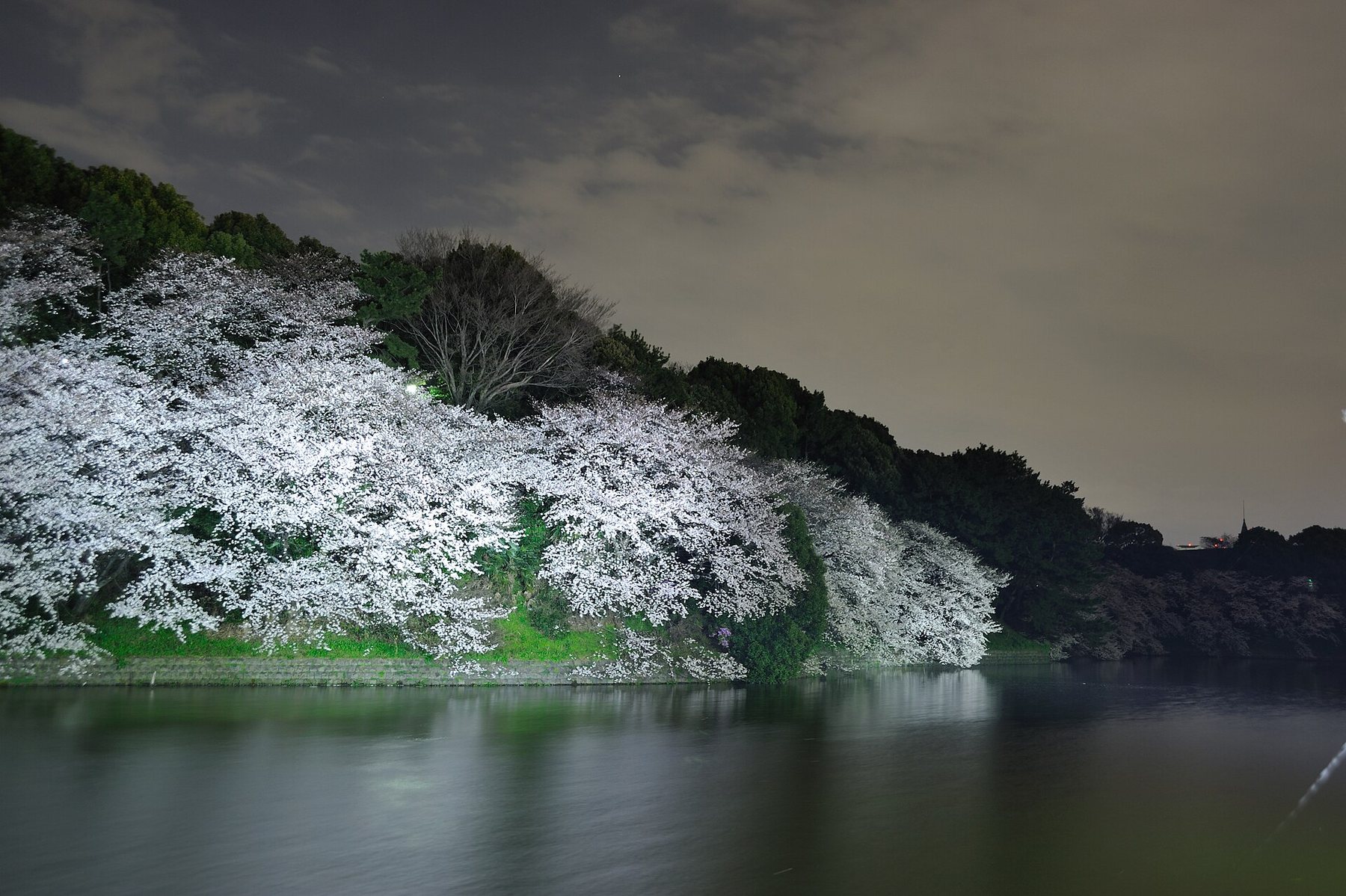
Why Tokyo's cherry trees now bloom before Kagoshima's
Of 48 weather stations, 46 see earlier cherry blossom. The two that do not are the two furthest south.
6 min read
Energy and environment | Climate
Of 48 weather stations, 46 see earlier cherry blossom. The two that do not are the two furthest south.
6 min read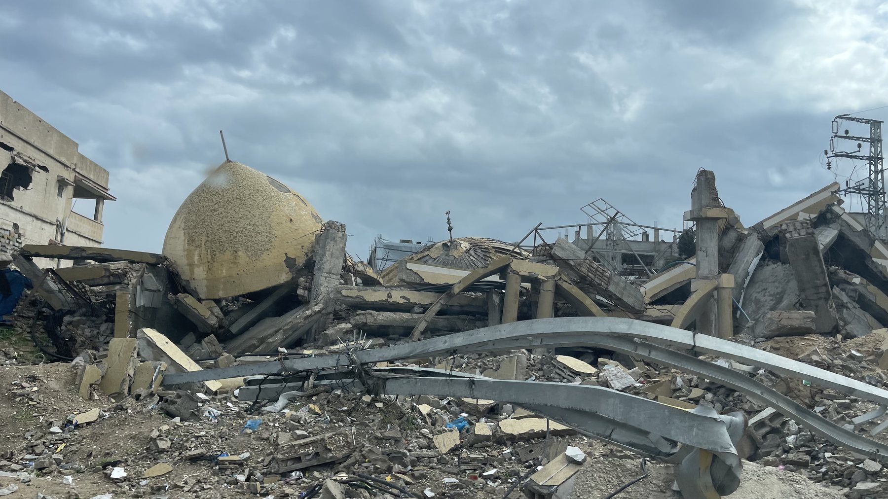 Politics | Gaza
Israel's own counts of targets and combatants leave half of Gaza's destroyed buildings, and two in three of its dead, without a military reason.
7 min read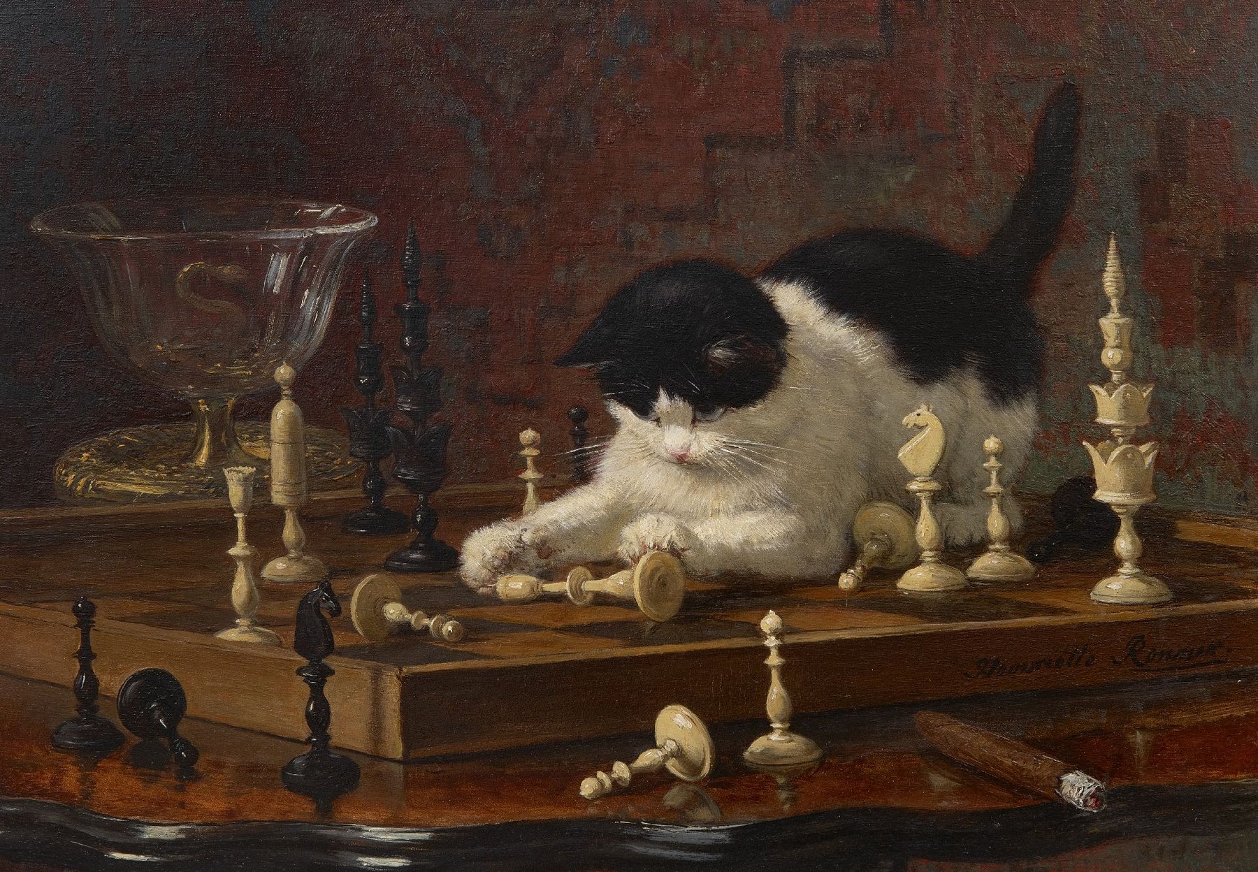 Culture and history | Chess
In 87m online games a loss costs 1.3 points in the next one, because players rush. The rest is form.
6 min read Society | Demography
A 50-year forecast for every state, with odds, and why its answer is either 36% or 71%.
7 min read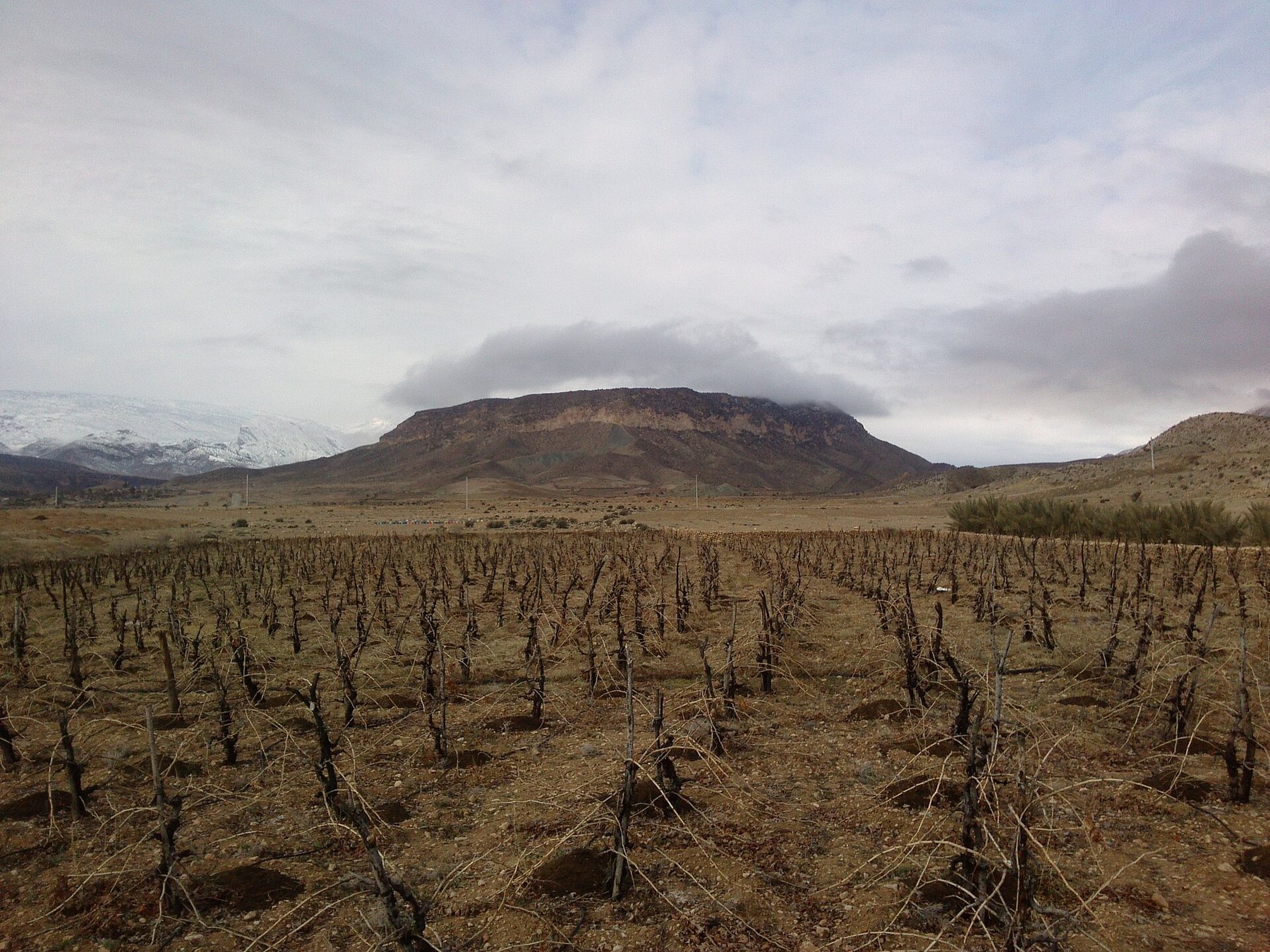 Economy | Wine
Mapping the world's unused vineyard land, and what a shrinking market would pay for its wine.
6 min readCount only non-Hispanic people who are white alone, and the white share of Americans falls from 56% today to a projected 36% in 2075. Count everyone classed as white or part-white, and it is 71%.
The world drank 208m hectolitres of wine in 2025, 17% less than at its peak in 2007. If the recent decline continues, the figure will be 168m by 2035.
Iran's inflation ran just 5 points above peer oil producers' during the nuclear deal. Since 2019 the gap has been 36 points. For households paid in rials, that is the sanction they feel most.
Every number we publish can be checked. The data behind our charts is on GitHub, one folder per article, each with a README that explains every file and how to cite it. It is free to reuse with credit; third-party data keeps its original licence.
All data on GitHubOne data-driven study a month, with the charts and the numbers behind them. Free.
Email sign-up opens soon.
Each study publishes its data and describes its methods in full, including the models that did not work.
Every study ends with the limits of its evidence, not just its findings.
Errors are fixed openly and logged on our corrections page, with the date and the change.